Usability in the Wild

The point of this blog isn't to make people feel bad, to insult anyone, or to imply that i'm the best usability person out there. No, the point is far more humble. First, it's to give me a place to vent. I see so many things out there that hurt me, and i need somewhere to let it out. Second, and more noble, i hope to help people fix the quick and dirty usability issues that crop up in the world. And third, hey, why not try to impress people, right?

 My Photo
Name: lkt
Location: Sunnyvale, California, United States

Thursday, May 31, 2007

creeping featurism

This is not original work. I'm copying the following text verbatim from this article. No matter how passionately i agree, i didn't write this. Also, read the whole article, and more importantly, look at the pretty pictures.


Is this to say that the Mac Plus is a better computer than the AMD? Of course not. The technological advancements of 21 years have placed modern PCs in a completely different league of varied capacities. But the "User Experience" has not changed much in two decades. Due to bloated code that has to incorporate hundreds of functions that average users don't even know exist, let alone ever utilize, the software companies have weighed down our PCs to effectively neutralize their vast speed advantages. When we compare strictly common, everyday, basic user tasks between the Mac Plus and the AMD we find remarkable similarities in overall speed, thus it can be stated that for the majority of simple office uses, the massive advances in technology in the past two decades have brought zero advance in productivity.
(emphasis is in the original text)

Sunday, April 8, 2007

we hurt the ones we love

I love amazon.com. It's my go-to place for shopping, and has been from the start. This is partially due to the fact that the vast majority of non-perishable items i buy are books, with the occasional CD or DVD thrown in for good measure, but also because i hate shopping. Though amazon has, at times, tried to annoy me to the point that i'd cease shopping there, i persist. Sadly, this is not due to the phenomenal user interface. Thus, i shall catalogue some of my complaints here, and reserve the right to make this a multi-part adventure. Let's begin.


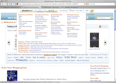
CONTEXT: Should one hover over the "See all 40 product categories" tab, intentionally or accidentally, this massive pop-up appears.

PROBLEM: Not only is this pop-up large, it covers a great deal of the page content (including the search field), and requires the user to push their pointer quite a ways to dismiss it. Further, it lists categories that i, as the user, have told amazon repeatedly that i don't like, never use, and would be quite happy to never be reminded that they exist. Why give me the option to say 'never show this to me,' only to show it to me?

SOLUTION(S): Get rid of it, or at least narrow the scope based on explicit and implicit preferences. On most pages, users can navigate categories with the left-side menu, or simply type some relevant term into the search field to get there. This short-cut isn't saving people much time, in general. And if just getting rid of the hover pop-up is out of the question, at least respect the user's preferences. I'm a fairly specialized user, and showing me links for 'tools and automotive' and 'baby apparel' is a waste of perfectly usable targeted advertising space. Then again, maybe amazon is trying to tempt me into perusing those categories. If so, they failed at that too.


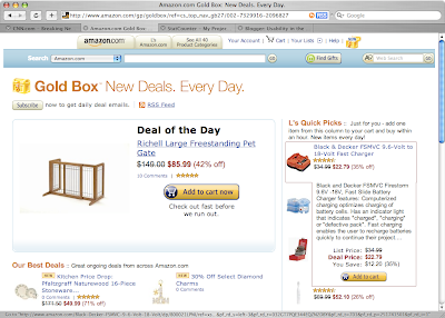
CONTEXT: Amazon has a 'gold box' of items with a special one-day discount. Users can only buy one such item per 24 hour period, so the page does its best to showcase them. However, hovering on any item other than the Deal of the Day results in, yes, another giant pop-up.

PROBLEM: While providing more information is useful, especially in a product feature area, having almost every pixel on the page trigger a pop-up that blocks other items on the page makes it very difficult to browse. In order to see everything, one must either find the tiny areas that don't trigger the overlays, or simply rest the pointer outside the window entirely. It seems that whoever implemented these pop-ups has never heard of Fitt's Law.

SOLUTION(S): Once again, removing the pop-ups entirely is an option, and one i support as a minimalist. However, the more reasonable one would simply be to tweak the triggers for the pop-up. For example, netflix has similar product detail overlays, but they appear only when the pointer hovers on the product image, not the text and short description as well. That way, not only is it easier to read the page without being inundated with extra information for products you probably don't want anyway, but when you actually do want the extra information, there are no clicks involved.


CONTEXT: The 'wish list' button was replaced with a 'your lists' button and drop-down.

PROBLEM: Diversifying the lists available to users seems like a perfectly good idea, until the user interacts with it. I keep 3 wish lists: one for normal stuff i want, one for academic-ish stuff i want, and a private one to keep an eye on products that i'm not yet sure i want. I can only get to the first of these, the 'default' by hovering until the pictured menu appears, and clicking on 'wish list'. The other lists require another click. Worse yet, if i click 'your lists' instead of hovering for a second to get the drop-down, i get shunted to a summary page with auto-populated shopping lists and the like for which i have no use, and must then filter through a cluttered page to find the 'wish list' link.

SOLUTION(S): First, give users the option to say, 'No, i will never use your 'shopping list', please stop filling my screen with it.' That's unlikely, given marketing and such, but would still be lovely. Second, if a user has more than one with list, list them all in the drop down instead of making the user hover, click, move the pointer all the way over to the left, sometimes scroll down, and click again. It doesn't take up much real estate, and simplifies the list viewing process tremendously.

Monday, April 2, 2007

Why i want to be a usability engineer/analyst/related job title

One of the companies to which i applied asked me to write a letter explaining my interest in the usability field, and in that company specifically. The following is the first part of the letter.

---

One of my earliest childhood memories is watching my mother dial the telephone, then place the handset in the sockets of a 300-baud modem attached to a monochrome terminal. She typed her e-mail messages very slowly using this setup, as if she outpaced the transfer rate she risked the remote computer terminating the connection, and there was no way to recover data lost with the link. She continued using the new technology despite the myriad hardships because of the benefits it provided.

Now, it is usually the limits of human perception and reaction that constrain our interaction with technology. 300-baud modems have given way to gigabit wireless connections, and laptop computers with 3 Mhz processors have replaced monochrome terminals. The tremendous speed of technological innovation has far outstripped the slower pace of investigation into how humans actually perceive and use technology, yielding a world full of hopelessly complex technology and a population ill suited to benefit from it.

The broken promises of our technological revolutions can’t be fixed with denser processors and faster upload rates; unusable technology, no matter how advanced, is useless. If usability experts had more opportunities to influence emerging technologies, and modify existing technologies, maybe some of the dreams of the technological age will finally come to pass. Perhaps computers will make our lives easier instead of more complex, and our workdays more productive instead of more frustrating.

It’s not just the high tech realm of computers and the Internet that has gotten more complex. One need only compare the engine compartment of a 1960s car with a modern one to see the difference: the dirty, greasy engine laid bare in an older car compared with the sleek, streamlined casing in modern vehicles that keeps your hands clean while you check the oil but hides all of the mechanical components. While changes in automotive technology produce more efficient and reliable vehicles, they also increase the complexity to the point where few people can repair their own vehicle even if they had the time and interest. In addition, dashboards that once featured a speedometer, odometer, gas gauge, and other mandatory dials are now cluttered with symbols and signals. Drivers have more insight than ever before into the workings of their vehicle, but much of it seems pointless. I have no idea why the airbag light illuminates for the first few seconds after I start my car, and I recently paid a fair sum of money for a technician to turn off the ‘check engine’ light, which was on despite my engine’s perfect health.

The incomprehensible notifications on my car’s dashboard don’t stop me from driving, and the clumsy user interfaces of various applications and websites don’t stop me from using my computer, but they do saddle me with the knowledge that I’m only reaping a fraction of the possible benefits. Millions of people all over the world are only achieving a fraction of their potential productivity or creativity because of the constraints of their technology. If I could help design or redesign software or devices to mitigate this wasted energy, I would truly feel that I’d helped people and earned my keep in the world.

Tuesday, January 30, 2007

Usability Professionals Don't Care About Usability, Right?

For those usability professionals out there without a job, or looking to upgrade, one of the resources available is the Usability Professionals Association job listings. Companies all over the place post jobs from entry-level to senior executive, and the best part is, they're companies that actually understand, at least to some extent, what usability professionals do. This is so much better than trying to convince companies that they really, really should hire you.

However, as is the case with most things, the audience will judge everything you do, whether or not it's relevant to your goal. And when your audience is usability professionals, you need to have a well-designed page. I mean really spiffy, intuitive, novel, and just plain wonderful. Thus, i'm a little surprised at the, well, unusability of the UPA job board.


CONTEXT: This screen shot was taken on January 29.

PROBLEM: One would imagine that users loading the page on that day would want to see the most recent listings first. However, The index stops at December. Currently (which is to say, as of January 30), you can click the link at the bottom left, the one that's purple from my exploration of the page, which will take you to another page, and that one actually has a link to January's posts.

SOLUTION: Easy, or hard, depending on what they want to do. The easy one is to verbally smack whoever it is that was supposed to update the links, and tell them to get on it. While they're at it, they can add February's link as well, it's only a day or two away. However, given how well that worked in the past 30 days or so, not to mention my general dislike for pointless busywork, i actually advocate the harder option. For a quick disclaimer, i'm not a coder. I have a basic knowledge of how the various coding languages work, but not enough to advocate one over another in most cases. Regardless, there is absolutely at least one way to create auto-updating pages. I wouldn't be surprised if there were dozens, which isn't the point. These auto-updating pages are far more reliable that the overworked employees who already have dozens of things to do and can't remember to add a 'January, 2007' link when they create the job page. While it may mandate a full overhaul of the job listings section, that's probably not a bad idea anyway. And with this, we leap to the next problem:


CONTEXT: This is the jobs page, where employers post their wishlists, and potential employees peruse.

PROBLEM(S): Notice anything missing? Like, a search option, or a sort option, or a filter option? This is just a plain text page, and while i'm a huge advocate on skipping all the pointless eye-candy, they skipped the functionality too. Job postings for senior executives are mixed in with postings for fresh-out-of-grad-school information architects. Whether you're one of these, the other, or somewhere in between, it's a waste of your time to browse the jobs for which you are completely unqualified or overqualified.

SOLUTION: Again, the solution wanders into the technology that i don't know as well as some, but given the myriad pages out there that implement search, tags, keywords, sorting, and the like, there's no reason this page can't either. If that's too much to ask, they could simply add a 'category' line or some such, dividing listings into groups such as 'entry-level', 'experienced', 'executive', and the like, so browsers can use their 'find' functionality to zip through to appropriate listings. As before, the techie option is the better option, but something is better than nothing.


CONTEXT: The bottom of each month's job listings page. This appears to be a template for job posters to use when creating their listing.

PROBLEM: First and foremost, it's at the bottom of a page primarily used by job seekers, not companies listing jobs. If it should be anywhere, it should be in the 'how to post a job' section. That, best i can tell, simply advises posters to use plain-text format. My sneaking suspicion is that it's there for the person who converts the plain-text submissions into the UPA format. They can just copy and paste the template to the top of the page, then copy and paste the content in.

SOLUTION: Once again, UPA seems to run its job board on the labor of people who could probably be doing much more useful work instead of a series of copies and pastes. The technology required to create a form that posters can fill out with the details is not so expensive or convoluted as to justify not using it. In fact, i think it's pretty simple. I've watched people make web-based forms in minutes. So, once again, i advise the creation of a web form that posters can simply fill out and, subject to some sort of review, can simply be added wholesale to the jobs page. Despite requiring a bit of up-front work, it saves time, effort, and annoyance later on. Plus, it means i don't have to see the template at the bottom of every page.

Monday, January 29, 2007

How To Be Unhelpful

Everyone picks on Microsoft, so i try not to. On the one hand, it's shooting fish in a fish market. On the other, it's over-done and passé. But this example just cut too deep.


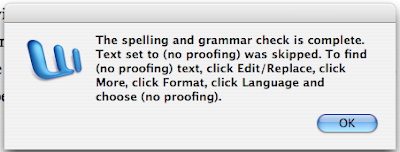
CONTEXT: This box popped up at the end of the spelling and grammar check, as indicated. The document in question is very long, over 50,000 words. I've used MS Word for almost 10 years now and i've never, ever seen this box before.

THE PROBLEM(S): I almost don't know where to start, but i'll go with the meta-problem and work my way down. First, the box gives me a set of somewhat complex instructions that i can't follow until i've dismissed the box. Thus, my only options are to memorize the steps, or write them down (or, i suppose, do a screen capture, which i clearly did but for other reasons), before dismissing the box and following the directions.

Second, what the heck is (no proofing), how did i set text to that, and why do i care? My assumption, as a disgruntled user, is that this is the text that i, after 57 or so rounds with the grammar and spell check, insisted really, really didn't need to be 'corrected'. But who knows...

Third, why is this, whatever it is, under 'language'? And why is that under 'format'? And why is that under 'more' (one of the most vacuous and useless menu items ever)? Replace these with domain-specific words and anyone could smack you for using jargon. But here, they're just... not helpful.

THE SOLUTION: Easy. Astonishingly easy. Add a help button to explain the issue, another button that transports me to the end result of the instructions provided, and change the text accordingly. Something along the lines of: "Some of the text was not checked due to user settings. To see this text, click the 'see unchecked text' button."

Things That Hurt Me

The point of this blog isn't to make people feel bad, to insult anyone, or to imply that i'm the best usability person out there. No, the point is far more humble. First, it's to give me a place to vent. I see so many things out there that hurt me, and i need somewhere to let it out. Second, and more noble, i hope to help people fix the quick and dirty usability issues that crop up in the world. And third, hey, why not try to impress people, right?