

we hurt the ones we love
I love amazon.com. It's my go-to place for shopping, and has been from the start. This is partially due to the fact that the vast majority of non-perishable items i buy are books, with the occasional CD or DVD thrown in for good measure, but also because i hate shopping. Though amazon has, at times, tried to annoy me to the point that i'd cease shopping there, i persist. Sadly, this is not due to the phenomenal user interface. Thus, i shall catalogue some of my complaints here, and reserve the right to make this a multi-part adventure. Let's begin.
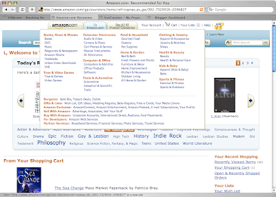
CONTEXT: Should one hover over the "See all 40 product categories" tab, intentionally or accidentally, this massive pop-up appears.
PROBLEM: Not only is this pop-up large, it covers a great deal of the page content (including the search field), and requires the user to push their pointer quite a ways to dismiss it. Further, it lists categories that i, as the user, have told amazon repeatedly that i don't like, never use, and would be quite happy to never be reminded that they exist. Why give me the option to say 'never show this to me,' only to show it to me?
SOLUTION(S): Get rid of it, or at least narrow the scope based on explicit and implicit preferences. On most pages, users can navigate categories with the left-side menu, or simply type some relevant term into the search field to get there. This short-cut isn't saving people much time, in general. And if just getting rid of the hover pop-up is out of the question, at least respect the user's preferences. I'm a fairly specialized user, and showing me links for 'tools and automotive' and 'baby apparel' is a waste of perfectly usable targeted advertising space. Then again, maybe amazon is trying to tempt me into perusing those categories. If so, they failed at that too.
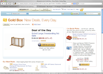
CONTEXT: Amazon has a 'gold box' of items with a special one-day discount. Users can only buy one such item per 24 hour period, so the page does its best to showcase them. However, hovering on any item other than the Deal of the Day results in, yes, another giant pop-up.
PROBLEM: While providing more information is useful, especially in a product feature area, having almost every pixel on the page trigger a pop-up that blocks other items on the page makes it very difficult to browse. In order to see everything, one must either find the tiny areas that don't trigger the overlays, or simply rest the pointer outside the window entirely. It seems that whoever implemented these pop-ups has never heard of Fitt's Law.
SOLUTION(S): Once again, removing the pop-ups entirely is an option, and one i support as a minimalist. However, the more reasonable one would simply be to tweak the triggers for the pop-up. For example, netflix has similar product detail overlays, but they appear only when the pointer hovers on the product image, not the text and short description as well. That way, not only is it easier to read the page without being inundated with extra information for products you probably don't want anyway, but when you actually do want the extra information, there are no clicks involved.
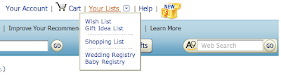
CONTEXT: The 'wish list' button was replaced with a 'your lists' button and drop-down.
PROBLEM: Diversifying the lists available to users seems like a perfectly good idea, until the user interacts with it. I keep 3 wish lists: one for normal stuff i want, one for academic-ish stuff i want, and a private one to keep an eye on products that i'm not yet sure i want. I can only get to the first of these, the 'default' by hovering until the pictured menu appears, and clicking on 'wish list'. The other lists require another click. Worse yet, if i click 'your lists' instead of hovering for a second to get the drop-down, i get shunted to a summary page with auto-populated shopping lists and the like for which i have no use, and must then filter through a cluttered page to find the 'wish list' link.
SOLUTION(S): First, give users the option to say, 'No, i will never use your 'shopping list', please stop filling my screen with it.' That's unlikely, given marketing and such, but would still be lovely. Second, if a user has more than one with list, list them all in the drop down instead of making the user hover, click, move the pointer all the way over to the left, sometimes scroll down, and click again. It doesn't take up much real estate, and simplifies the list viewing process tremendously.